
Setting Idenfo up for its next decade of growth
The Software Development Kit(SDK) Market is driven by a growing adoption of cellular technology worldwide(Phone,Tablet, PC,Other) The market can further be segmented into operating systems(IOS,Android, Others) The investors at Idenfo foresaw this market opportunity as technology was being adopted fast in the countries they were building their SDK for. They started off with Pakistan due to its less competitive landscape; investors were optimistic about the results that this SDK would produce.I was responsible for designing the SDK to ensure a standardized journey and consistent UX. The SDK’s UI was intentionally made customizable to suit the integrating app’s unique design. For example, the Easy Paisa SDK’s UI differed significantly from the one I designed.
Challenges
The platform had significant tech and UX debt from years of neglect. However, the biggest challenge was addressing the underlying reasons why the team hadn’t invested more time in building the SDK platform in the first place.
Resources not allocated Properly
Although Idenfo had dedicated resources, including skilled developers, testers and a designer. These resources, including myself, would often get diverted to work on other critical tasks.
Relying on Pre-built kits
While the Pre-built kit allowed developers to save time by the launch of our first MVP.It was not sustainable with our long-term vision due to high licensing fees and limited customization.
Designing without scale
When I initially designed the SDK, I designed it according to Idenfo’s brand guidelines.This limited the scope of the SDK as it indicated branding limitations to the client. The endless possibility of customisable integration was crammed into Idenfo’s branding language.
Approach
Even though the screens for the SDK were limited, continuous reiteration of the designs was necessary because the business and tech squad intended to pitch the SDK to different regions with a much more competitive SDK landscape. My main tasks were focused on reducing the touchpoints in the journey, collaborating with the developers to ensure that the designs were compatible with the tech stack being used, and incorporating accessibility guidelines into the flow.
Additionally, I also had a time constraint of two weeks. Therefore, I had to hand over the screens for the development cycle to start and for the QA to begin testing. I also needed time to incorporate changes based on the feedback I received from the tech team.
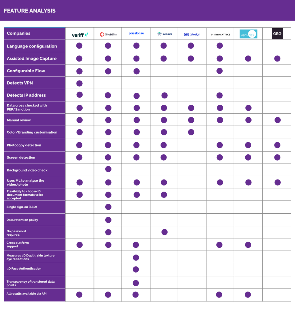
Benchmarking our competitors
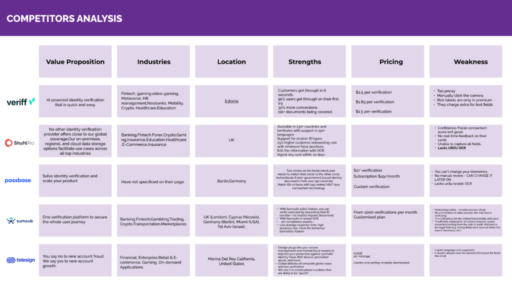
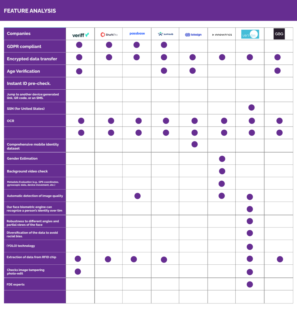
We checked out demos from 5-7 IDV companies to learn about their products and understand what they’re good at and where they could improve. I looked at how easy their products were to use, while the IDV squad leader and AI engineer focused on the technical stuff. Then, we compared their features and where we stand in the market before creating our own solution.
It took 2 weeks to complete this, a lot of the companies were not transparent about pricing so we had to leave that empty in our analysis but we had a general idea of the pricing in different market regions.
Introducing Design Workshop
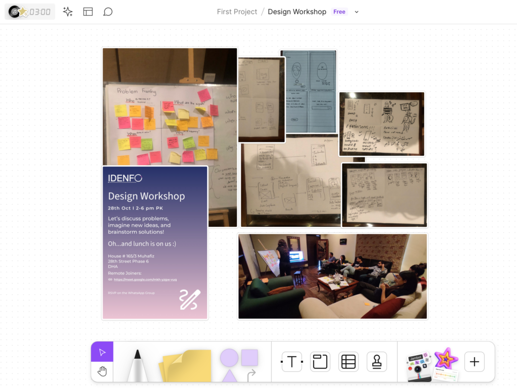
Design Workshop: Improving the SDK for B2B2C Businesses
I led a design workshop with the IDV squad to tackle a critical challenge:
B2B2C businesses struggle to use the SDK due to slow performance and poor UI—particularly during CNIC photo uploads, where users often have to repeat the step multiple times.
1. Establishing a Shared Understanding
To align the team, we started with:
- Icebreaker Session: Team members shared three random things about themselves to foster an open, collaborative space.
- Background & Demo: Engineers walked non-technical members through the current SDK, highlighting slow processing and retry issues in CNIC uploads.
2. Identifying the Core Pain Points
We structured the problem using the Who, What, Where, and Why framework:
- Who is affected? B2B2C businesses and their end users.
- What is the issue? Slow performance and poor UI, especially during CNIC photo uploads.
- Where does it happen? Specifically in biometric verification and card verification steps.
- Why does this occur? Inefficient processing, poor UI feedback, and a lack of real-time validation.
3. Brainstorming & Ideation
- Analogy Exercise: We explored seamless ID verification experiences from other industries to identify best practices.
- Silent Brainstorming: Team members independently generated solutions.
- Crazy 4’s in 8 Minutes: Instead of Crazy 8’s, we focused on four rapid sketches in 8 minutes to visualize improvements.
- Discussion & Refinement: We grouped ideas into themes and identified the most promising solutions.
4. Prioritization & Key Voted Features
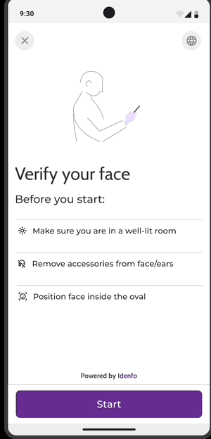
Biometric Verification Enhancements
✅ Masking the Circle: Adding a clearer face boundary guide.
✅ Dynamic Face Positioning Feedback: Highlighting half of the circle when the face moves left, making alignment easier.
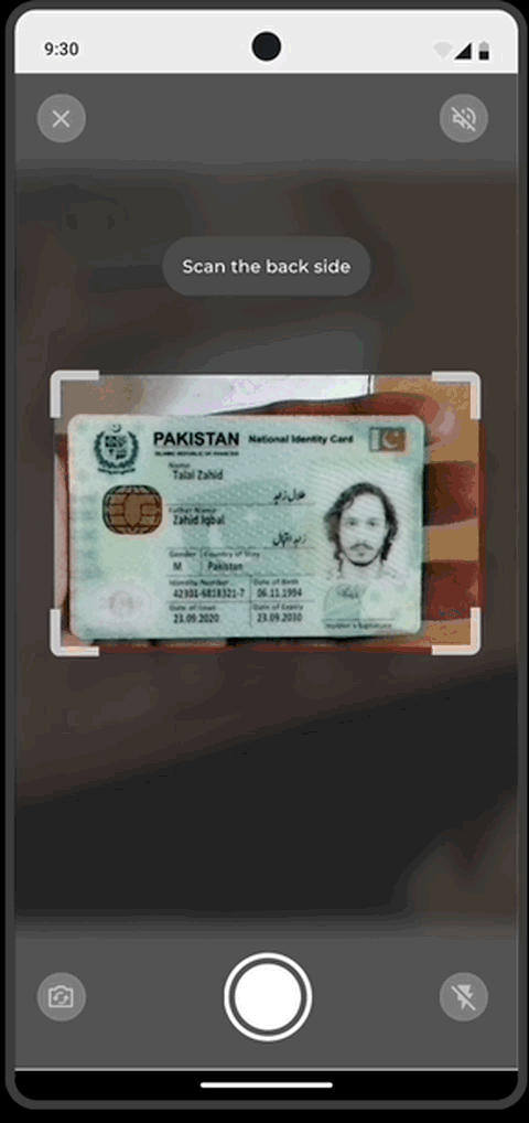
Card Verification Improvements
✅ Support for Regional Languages: Expanding accessibility by including more local language options.
✅ Reducing Touchpoints for Card Validation: Instead of requiring users to press a button, turning the “Retake” button into a live re-take screen for a smoother experience.
Results
Focusing on the Micro-interactions rather than the UI
While the UI of the SDK was intentionally kept minimal to accommodate customization according to the platform it’s integrated on, I focused on designing multiple interactions within the SDK to enhance the UX.
To provide a seamless experience, I implemented animated buttons to indicate progress to the user, eliminating the need for a loader screen. Additionally, users have the flexibility to review or change their image if they feel they’ve made an error.
Instead of displaying all the OCR information from the CNIC simultaneously, I employed motion to sequence them chronologically using a fade animation, enhancing readability and comprehension.
To further enrich the user experience, I leveraged Material Design’s free sound library to reinforce positive and negative messages. For instance, I incorporated a hero sound accompanied by a Lottie GIF animation to celebrate the user’s accomplishments when the CNIC has been successfully verified.
Designing For Device Orientation
While most devices come equipped with an accelerometer for automatic screen orientation adjustment between portrait and landscape modes, the developer recommended designing specifically for device orientation to ensure the optimal experience, considering that our SDK wouldn’t have an embedded accelerometer.
Designing for horizontal landscape orientation would potentially yield higher verification success rates for biometric verification, as landscape photographs generally offer higher quality images, allowing our OCR to capture details more accurately. Moreover, it would enhance flexibility for users.
I selectively incorporated orientation support into screens where it was deemed necessary, such as when the user takes a picture, as excessive orientation adjustments could potentially confuse users.
Support right-to-left languages
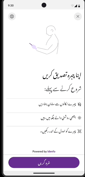
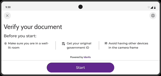
Users expect the interface to adapt its layout automatically when they choose their language. Unless the system has a UI framework that supports right-to-left (RTL) by default, allowing system-provided UI components to flip automatically. I wanted a more authentic touch of localization rather than what the system had to offer.
Research has shown that users find it easier to use the Noto Nastaliq Font rather than the Inter font that the system converts the language into.
A fluent Urdu voiceover was needed for the Urdu Language Settings, if switched on.
The typography of the font, such as the line height and the color, needed to be adjusted to match accessibility guidelines.
To ensure a comfortable reading and scanning experience, I reversed the alignment of all items in a list rather than using a mix of two languages, making it a confusing experience for users.
Because people tend to view forward progress as moving in the same direction as the language they read, it makes sense to flip controls like sliders and progress indicators in the RTL context. When you do this, I reversed the position of the icons, GIFs, or images that depict beginning and ending values of control
Device Compatibility
By testing on various devices and programming languages.I worked closely with the QA team to ensure that SDK is compatible with various platforms, operating systems. I tracked all the bugs and the inconsistencies in design on an excel sheet, and had a meeting with the developers to ensure that the UX ran smoothly.
Utilised in the market

Key Learnings and Takeaways
🔹 Limited Regional Language Support: The current solution was not designed to support other regional languages, which impacted accessibility.
🔹 Not Yet Optimized for Web Screens: The SDK was initially designed for mobile, but web adaptation was not considered.
🔹 Higher Development Time Required: The proposed improvements required more development effort than expected, which impacted timelines.
🔹 Lack of Pre-Deployment Usability Testing: Usability testing was missed before shipping to the client, leading to unknown issues on different devices. Future iterations will need thorough testing across multiple devices before deployment.