Designing Pakistan’s first guard hiring app
A recent study carried out by the Karachi police and shared with the media indicated that the available strength of 26,847 law enforcers for the city is much below the requirement and a policy in this regard is required to be reviewed for the vibrant city of 22 million people.Crime is a big issue in a city like Karachi, but we couldn’t build an entire app based off an assumption. I had to go ahead and test the hypothesis.
Challenges
Developing an app for digital onboarding of guards presented unique challenges due to the absence of a pre-existing working model for reference. While there were analogous competitors such as ride-hailing apps and traditional security services, a Software as a Service (SAAS) solution in this domain was non-existent. To address this, I embarked on an intensive journey involving exhaustive user testing and collaborative design sprints with the team. This process yielded multiple iterations of the Minimum Viable Product (MVP), ensuring that our final solution was well-informed and user-centric
While I crafted a custom design system for the app, based on the given logo. The main challenge was to managing the guards and vetting the customers, who hired these guards. Users joining the app had to go through a biometric check provided by Idenfo. But later, we realised that many users were quitting because they didn’t trust the new app due to the biometric feature.
Validating the hypothesis


I embarked on the project by initiating a hypothesis survey to ascertain the anticipated needs. First step was formulating a hypothesis and validating it, before pouring money into the project.
Hypothesis: Younger and Professional trained guards will lead to a more safe environment.
Null Hypothesis:Younger and Professional trained guards will not lead to a more safe environment.
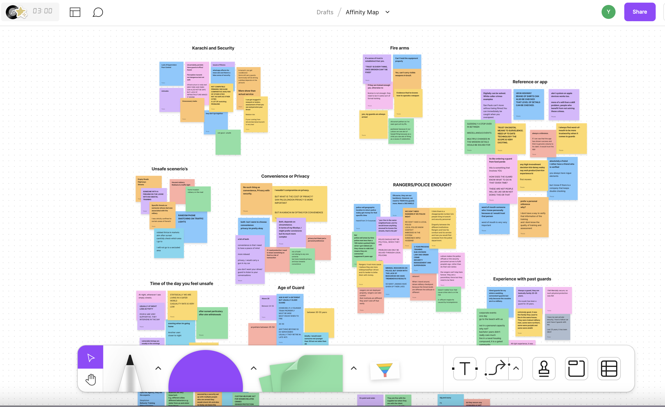
I undertook a comprehensive analysis through thematic examination and created an affinity map to identify the most crucial features. I found out that while people were hesitant to onboard guards digitally, they were excited about the possibility of an app that gives them this service as long as the trust factor was established.

As the beta version of the app materialized, I proceeded to conduct an observation analysis. This phase entailed tracking participants’ eye movements and gauging their interactions within a time-constrained environment. My methodology incorporated the utilization of a rainbow spreadsheet to systematically measure pain points and identify successful user pathways.
Drawing insights from the analysis, I iterated on the initial designs to enhance feature functionality. Four months post the app’s launch, a pivotal realization emerged. I discerned the potential to streamline the user journey by eliminating redundant screens, thereby fostering a more fluid and intuitive experience. This strategic adjustment aimed to ensure a seamless interaction paradigm for users.
User Persona’s and User Journey Mapping
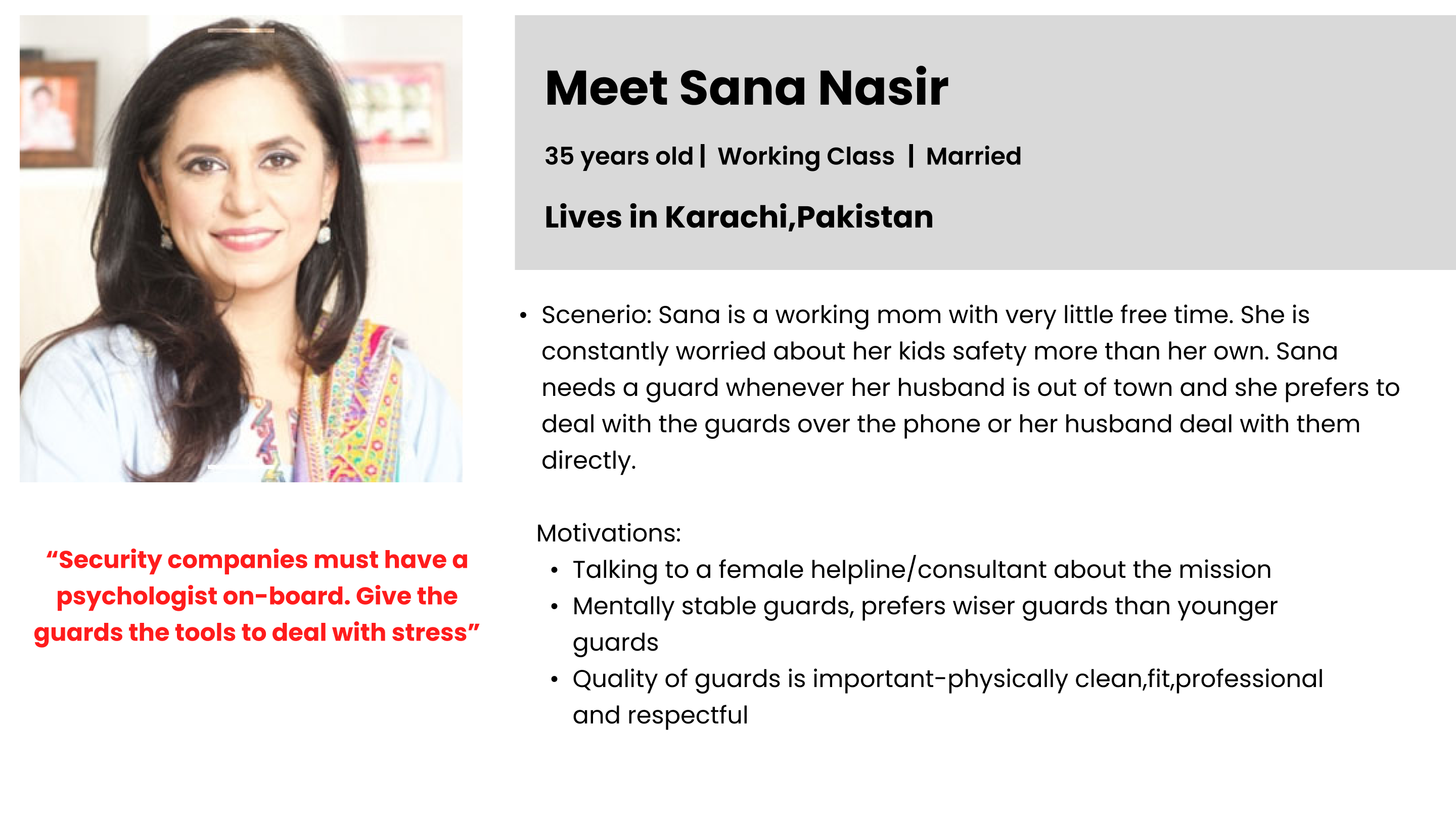
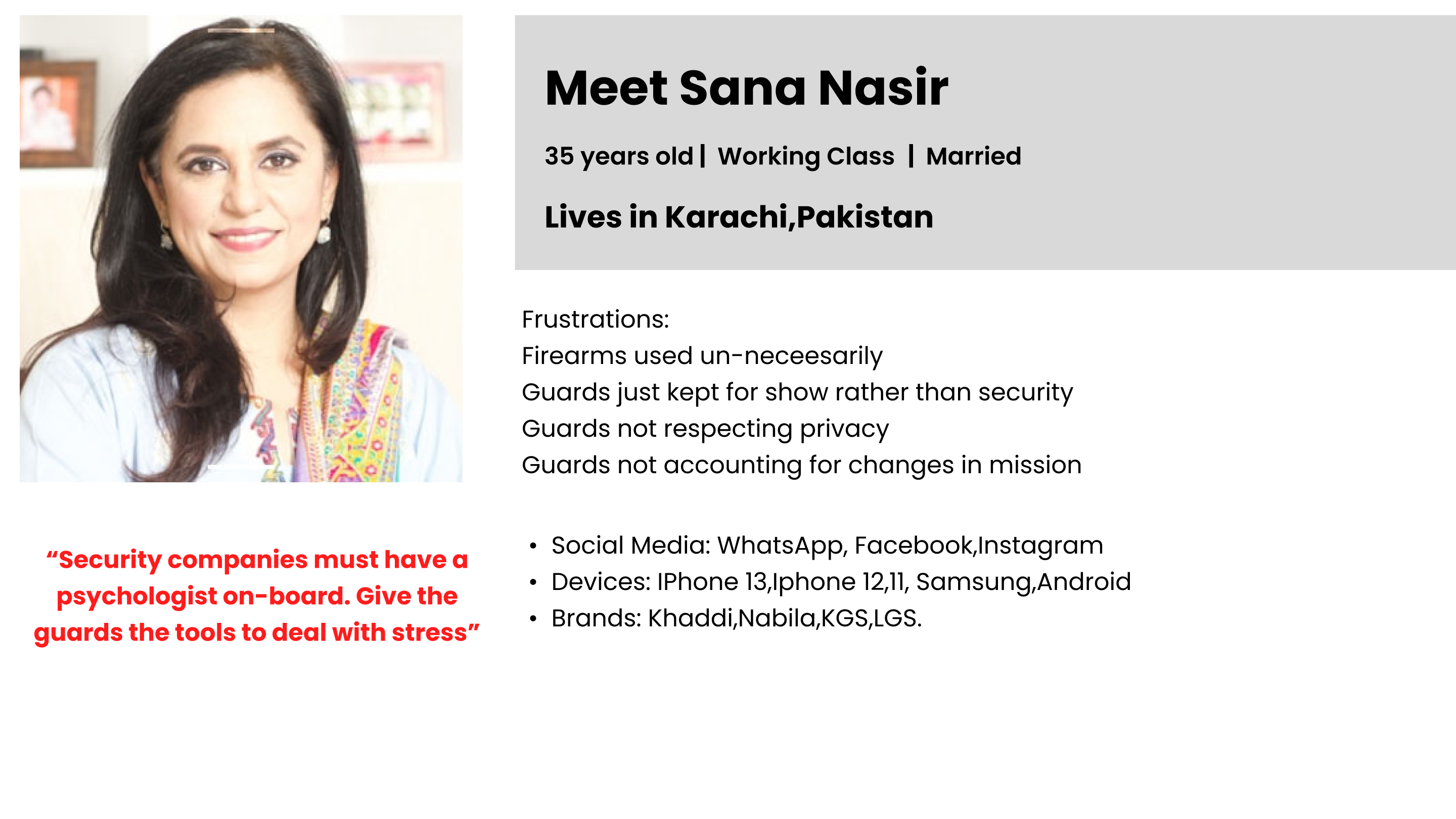
Typically, 3 user persona’s are enough for one product. I’ve attached a picture of one of the user persona’s I worked with. All the information in the persona is extracted from a user interview except the name and picture for confidentiality purposes.
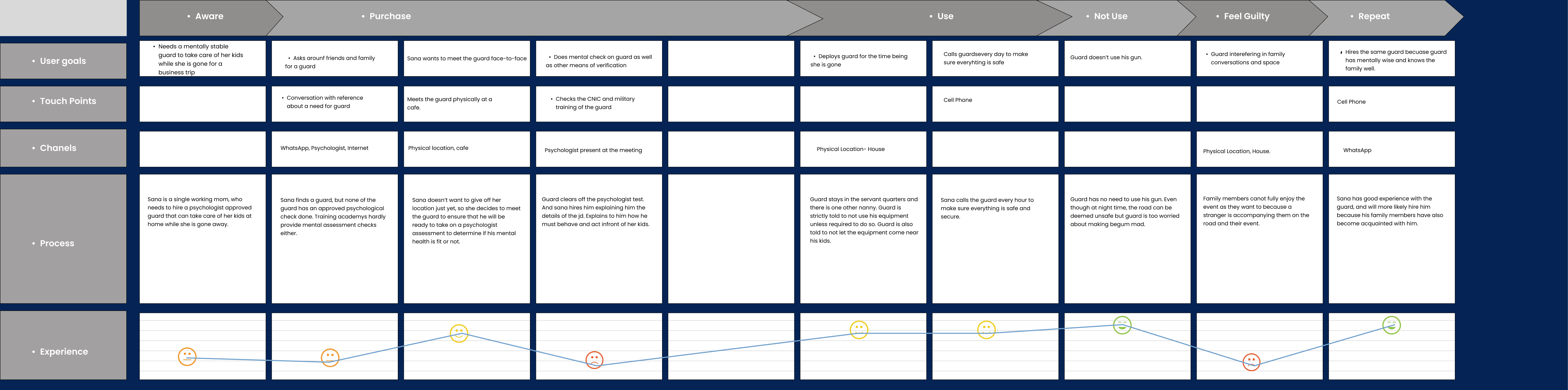
I also crafted three different user journeys with different motivations for each persona that I laid out. When I showed this to my stakeholders and the developers, this really helped them visualize how their end-customers would interact with the app. User journey’s are an excellent tool to use during pre-discovery because they will help visualize the touchpoints your customers will experience before, during and after the app is being used.
Establishing a writing style for the UX
I meticulously crafted a UX writing language that not only established the brand’s tone but also introduced a spoken style. This approach, while maintaining grammatical accuracy and avoiding informality, created a more approachable and easily understood communication style. This adaptation was specifically designed to foster a deeper connection between Fikrnat and its users. The intention was to establish a partnership dynamic where users and the platform collaborated as allies in the battle against escalating crime rates in Karachi.
Moreover, this unique writing style served a strategic purpose in highlighting our competitive edge. By swiftly conveying our Unique Selling Point (USP) through the writing style itself, we ensured that the distinct advantage of choosing Fikrnat was immediately evident to users.
For a more comprehensive understanding of this distinctive UX writing approach, I invite you to consult the attached document. It provides further insights into the rationale, methodology, and outcomes of this strategic choice, emphasizing our commitment to establishing a strong brand identity and enhancing user engagement.
Back-end:Invisible features enhancing the experience
Our backend applications played a pivotal role in ensuring guard punctuality and maintaining a robust client database. A key innovation was the creation of a guard app in Urdu, which enabled guards to log in, receive mission alerts, and signal their availability, facilitating efficient coordination between them and the control room. Notably, the control room was equipped with the capability to track guard locations and journey distances, providing a comprehensive overview of their deployments. Furthermore, the incorporation of a risk matrix on the map, a forthcoming feature, will empower the control room to make informed decisions about guards’ arms and ammunition requirements based on the risk level of their designated areas, enhancing safety and operational effectiveness.
Results
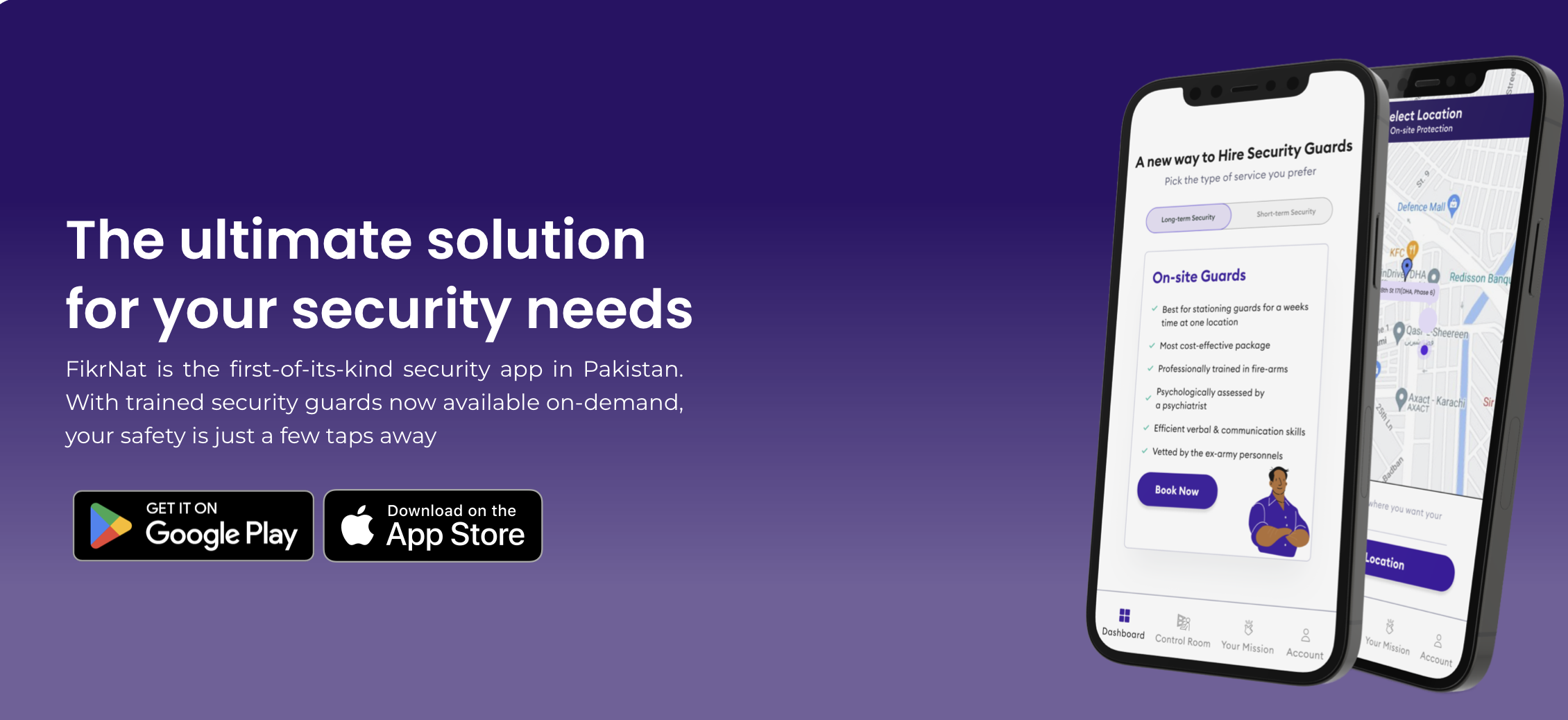
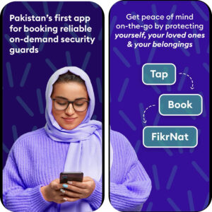
App Launched on Android and IOS
Upon launching the app on Google Play Store and iOS platforms, I swiftly rectified initial documentation gaps, ensuring comprehensive user information. Responding to Apple’s requirements, I integrated an account deletion feature, aligning with platform regulations and enhancing user control. Additionally, our app’s inclusivity was amplified by the introduction of a countrywide feature, enabling users from diverse regions to sign up using any phone number, highlighting our commitment to accessibility and global usability.