Rethinking customer investment journey with HBL
Given the uncertainties and challenges the economic and market conditions within Pakistan, HBL understood that introducing a systematic saving plan into their service offering is particularly important.
HBL’s wanted to introduce an easier method to cater to individuals, who are new to investing and find the technicalities of stock market overwhelming.
The answer: A systematic saving journey, where a customer can invest in mutual funds through fixed amounts of money at regular intervals of time. The idea behind SSP is to invest small amounts of money over a long period of time rather than put lumpsum amount in one go. 100
Challenges
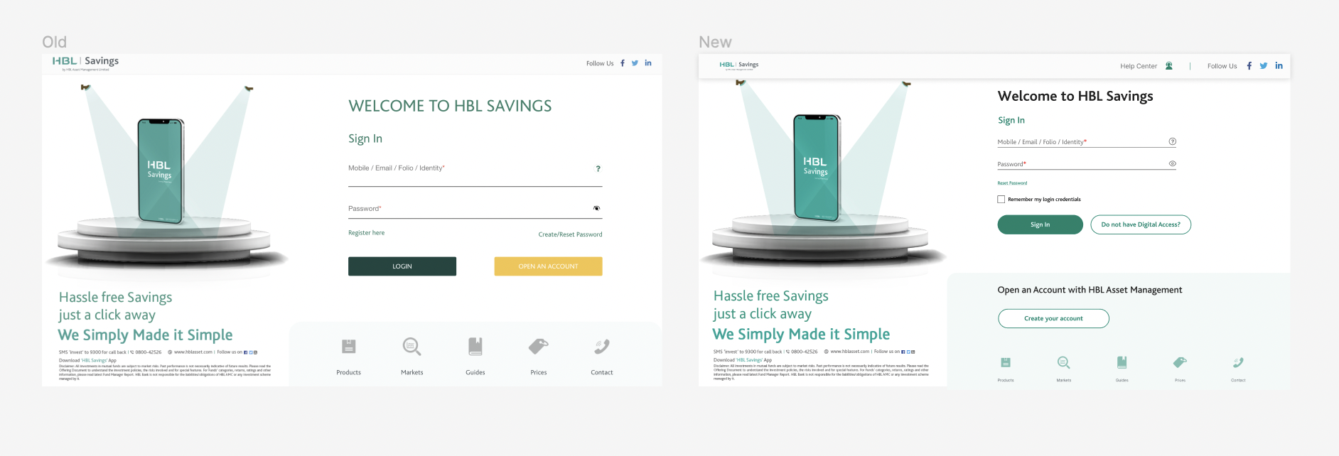
The design team at Idenfo had to design this interface journey within the constraints of the existing interface. The existing design was a pain-point to work with as it lacked the necessary simplicity and functionality to effectively communicate the latest service features that HBL AMC was offering to its users. Making significant improvements would require the HBL and the Idenfo to work together in lockstep towards a shared vision
An inconsistent and unpredictable experience
Not only was the Investment flow long, but it could vary dramatically. Different requirements were triggered by complex and unpredictable sets of criteria, so even existing HBL might suddenly encounter tasks they have never seen before:
- The visual design was not balanced in regards to the information and colours displayed on the interface.
- The RPQ flow was a long digital form that was little different to manually filling the form
- The structure of the environment and the information had numerous weak categories and listed multiple products within them. The usability impact? Users would spend too much time agonizing over top-level categories and then get confused when they see items showing up in multiple places(“are they the same thing?”
In reality, the effort required to sign up on an investment journey on HBL was far more complex than anyone realised. Visualising the number of frictions throughout the flow made the problem undeniable, which helped me persuade teams to build a better solution together.
Lengthy approval process
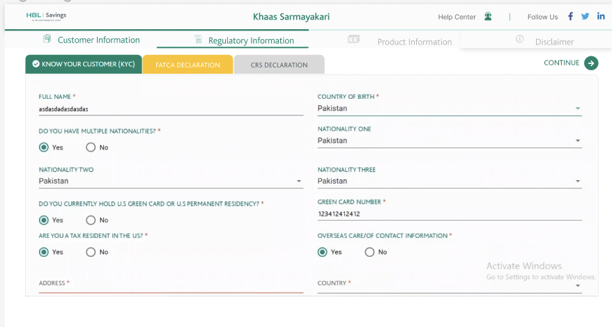
Following numerous collaborative meetings involving both internal and external stakeholders, including the HBL team and our internal product experts, we worked on the making the journey together. However, some parts of the Journey could not be reduced due to compliance requirements. Documenting the requirements,I meticulously ensured that the interactive journey was easy to use for first time users and was approved by HBL’s compliance team.
Approach
Create a framework for consistent design

Although this was out of the project scope required. As a designer, I felt
the existing HBL design needed a unified set of design principles, guidelines and components to ensure that all the digital touch points maintain a consistent look and feel. Because, I was asked to make more interaction journeys within HBL, the system could ensure that the design can scale seamlessly. The design system also enabled me to fix a lot of accessibility issues with the current system too.
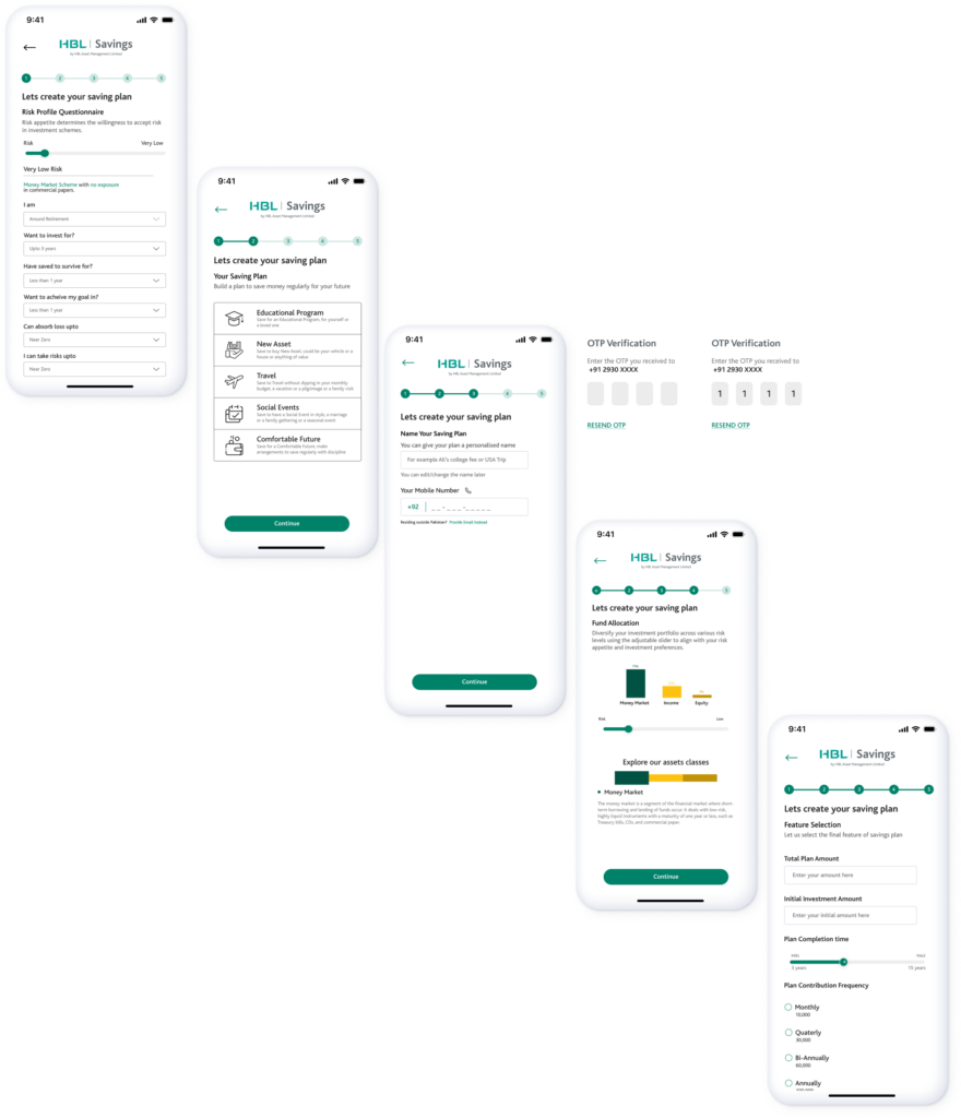
Breaking down steps and using white space wisely
Interactive RPQ slider while you learn with color keys
Because the investment flow was such a significant page to sell HBL’s service. Their team had crammed the flow full of content they wanted to ensure the customer would see. At some parts of the interface, the white space was completely crammed and at some parts it was completely left out.
I worked with each team to understand why components were arranged this way. I worked together to determine which content to eliminate and which content to leave to other product surfaces. I kept a stepper on the right side of the page which was being utilised and broke down each step to one screen, because I wanted the customers to be careful with their investment choices and have their focus on one step at a time.
I developed an interactive slider that allowed individuals to select their preferred risk profile within the investment plan. Upon making their choice, relevant options corresponding to each risk level dynamically appear. Additionally, users can conveniently proceed to the drop down menu, where they have the flexibility to adjust their information in accordance with the selections from the menu. This intuitive design enhances user engagement and customisation, providing a seamless pathway to tailor their investment strategy based on their risk preferences.
In addition, a color coded key similar to the bar graph was incorporated into the RPQ slider, offering customers a comprehensive understanding of various asset management classes. This visual guide serves as an educational tool, enabling users to gain insights into different investment categories through distinct color representations.
Results
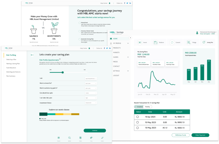
MoWeb, App and Website Integration
The design was a success and was approved by the client. It was later developed on HBL’s web, app and MoWeb platform, optimised for each device’s requirement on both IOS and Android.